If you are thinking on having the interior of your home painted selecting a wall color could be frustrating. Some people paint several sheets of paper or sample boards and hangs them on the wall to compare colors. It looks artistic and fun, but it may not be the most accurate way to vet wall paint.
Here I recommend you five tips to test paint colors before starting with your painting project.
1. Paint Directly on the Wall
This is true for interiors as well as exteriors: You’ll get the best sense of how the color will really look if you paint it directly on the wall. “If a board is used, it just doesn’t saturate the same way. The problem with using boards: “The texture is really not representative. It’s not the same as what’s on your wall, and that can really affect the look,”
Painting your choices side by side on the wall to see the differences. For some, this can be overwhelming to the eye; if that’s you, make it easier by leaving some space between the samples. Also, keep in mind that the existing color of the wall will affect how the paint reads. Colors will appear darker against a light backdrop and lighter against a dark backdrop. I recommend you to paint with white color the area where the testing colors will be applied to create a canvas that allow you to see the real colors that you are testing.
2. Paint Two Coats
That’s the amount of coverage you’ll typically need on any wall. The second coat usually makes a big difference in the way the paint reads. Also, paint large swaths — at least 1 foot by 1 foot, and even larger is better. The 2-inch swatches won’t give you a good sense.
3. For Certain Rich Colors, Use a Primer
A small selection of deep paint colors can be created only in conjunction with specific primers. The paint deck will show which colors are in this category.
4. Paint Multiple Walls
The colors you’re testing will read differently depending on the amount of light that hits them. “We recommend you paint on a wall that doesn’t get direct sunlight and one that does.”
Also, landscaping, outside a window can color the light streaming through it and change how a paint looks on the wall as well.
As you view the colors, make sure you consider what time of day you’ll most often be in the room. You want to like how the color looks at that time.
5. Place Lighting Before You Test
It’s simple, but true: It’s better to use the lighting that fits your needs than try to select your lighting to complement your paint colors. “You wouldn’t want to pick a lightbulb that looks good with your paint color, but you can’t read in the room.”
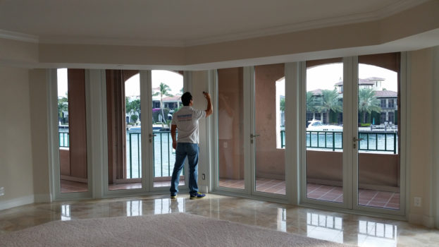
Here, the overhead lighting is casting a yellow glow throughout the room, warming the color of the off-white paint toward a pale shade of honey.
Make sure your lighting is in place as you’re considering colors. They may look quite different in bright bulbs or softer yellow hued ones. Having the right fixtures and bulbs in place can help you decide which shades will work for you.
If you’re not yet sure what lighting you prefer, you can use the time examining your samples to experiment. “Even changing out lightbulbs is a good thing to do,”
Before you start with your decorating project I recommend you to read my article 10 rules for your painting project. It will help you to make your painting project look flawless and balanced.
Julio Catano
Masterpiece Painting Contractors, Inc.